 Location experiences
T-Mobile Coverage Map
Making network coverage easier to understand for millions of customers.
Lead Product Designer
I led the Coverage Map redesign from problem framing through interaction design, testing, and engineering handoff.
I worked with PM, engineering, UXR, and content to simplify how customers understood network coverage. I reviewed 20+ existing UX studies, used interviews and usability testing to guide the design, and created reusable patterns for T-Mobile’s location experiences.
Will T-Mobile work where I live?
The map made it hard to tell.
8M people used the Coverage Map each year, and 61% visited while considering a switch to T-Mobile.
To understand a location, users had to interpret network types, signal strength, map legends, and technical coverage terms.
60% churn on the existing Coverage MapLow map comprehension contributed to people leaving the experience.
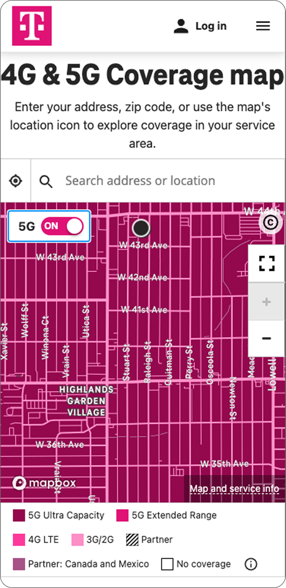
The existing map showed data, not answers.
The map showed the network data, but people still had to work out what it meant for their location.
 1
2
3
1
2
3
Controls and explanatory copy took up space users needed to explore coverage.
The legend showed multiple network and signal states, even when they did not apply to the location being viewed.
Labels such as 5G, 4G, and signal strength still left users figuring out whether they could call, text, stream, or stay connected indoors.
Make coverage clear before showing network detail.
I organized the experience around one question: am I covered here?
Technical network information stayed available, but the coverage answer came first.
Make the map the primary surface.
Heading, search, and legend take space from the map.
Full-height map. Details open in a bottom sheet over the same location.
Show only the coverage states that apply.
Every state, all the time, wherever you look.
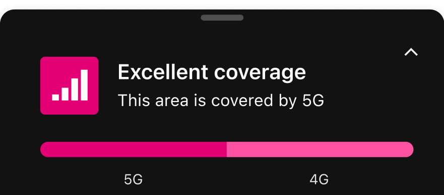
Only the states present in the current view.
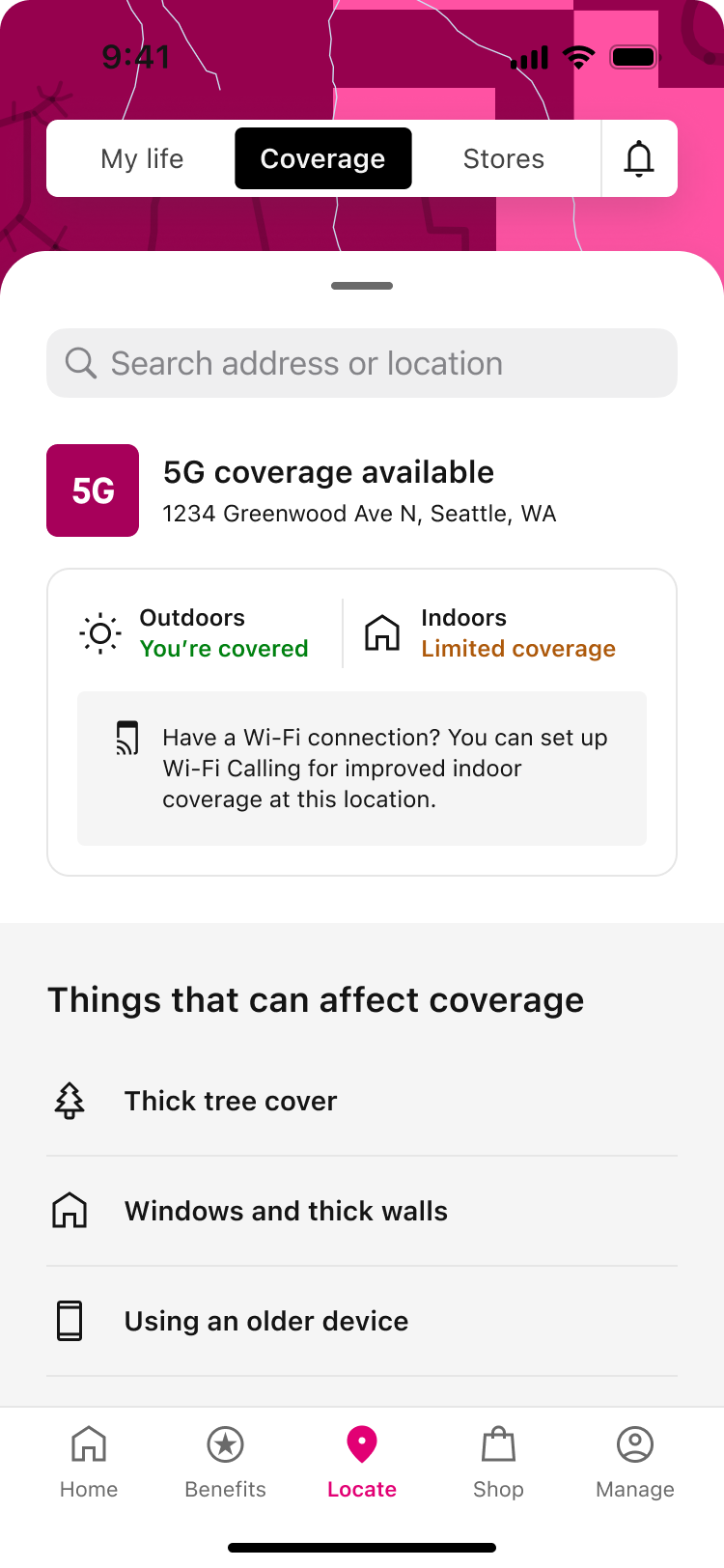
Explain what the network data means in practice.
Reusable patterns across T-Mobile’s location experiences.
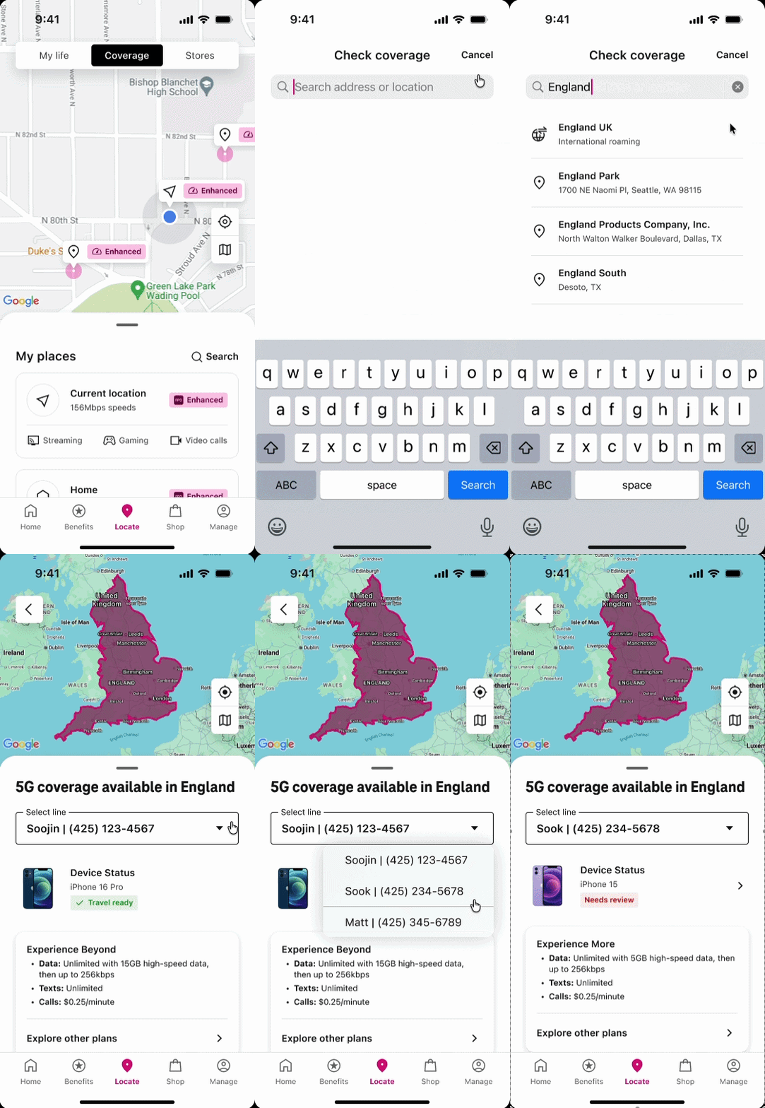
I created reusable patterns for coverage status, map pins, network icons, legends, bottom sheets, and location details.
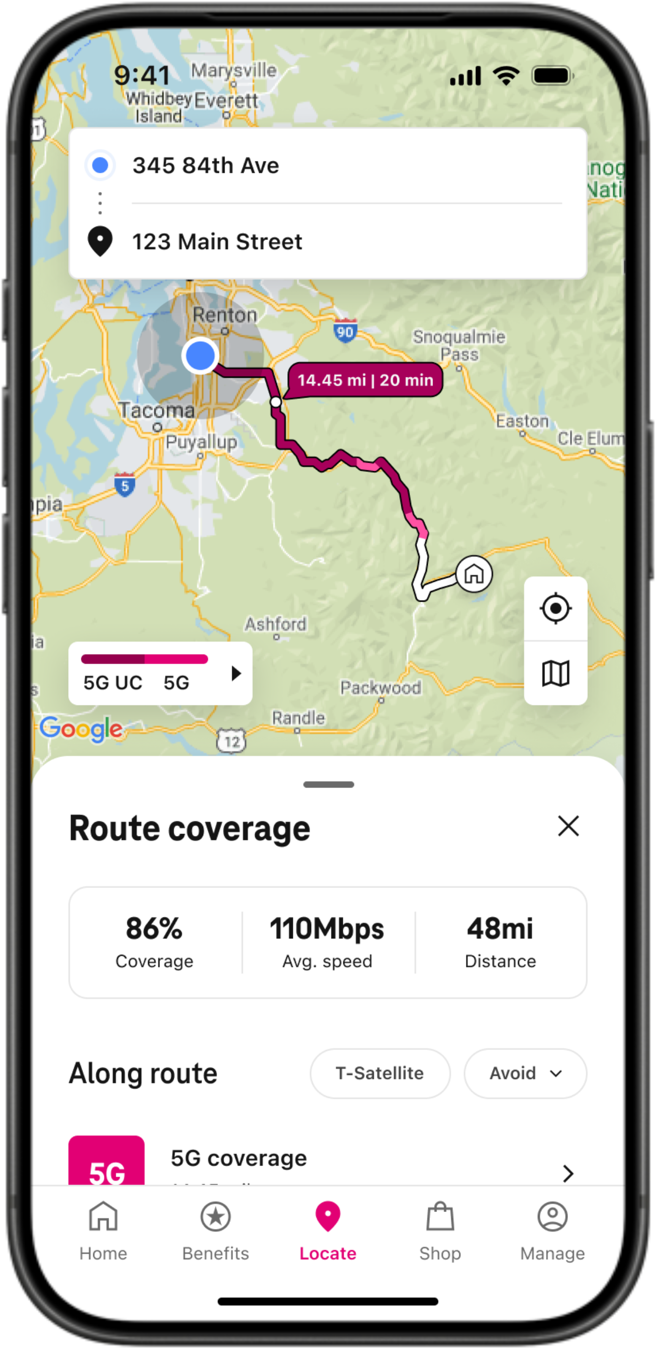
The same patterns were applied across Coverage Map, Coverage Route, and International Roaming.