Defining a 0→1 enterprise AI platform around the real research lifecycle, from data discovery to experimentation to infrastructure governance.
Engineering had already validated the technical infrastructure. What the company had not yet defined was who the core users were, how their workflows connected, where the product should begin and end, and what success looked like.
I joined as the founding product designer, working directly with the founders and four engineers. There was no dedicated PM or researcher, so my role began with defining the product problem before designing any interface.
My job was not to redesign an existing product. It was to help define what the product should become.
I proposed and led the research myself: 10+ user interviews, 10+ domain reports, and 20+ competitive products. One AI engineer described spending roughly two weeks just collecting usable data: asking colleagues, searching shared drives, downloading files, discovering inconsistent labels or licensing restrictions, and starting again.
The infrastructure worked. The research lifecycle around it was fragmented.
Both were core users of the same enterprise platform, but their jobs pulled in opposite directions. The solution could not be one generic interface.
Research led me to frame three systemic problems. They became the structure of the product, and of every decision after.
The original product boundary began at infrastructure execution: launch an environment, provision compute, run an experiment. Research showed users were already struggling before reaching that point.
So I recommended expanding the product upstream, making data discovery and evaluation part of the platform.
This increased scope and engineering effort. It also meant solving the actual end-to-end workflow rather than optimizing only the middle of it.
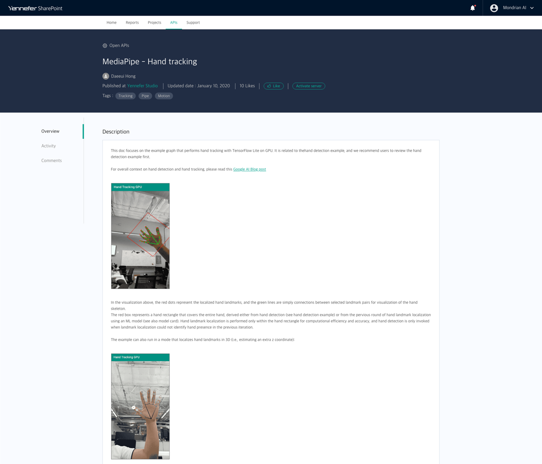
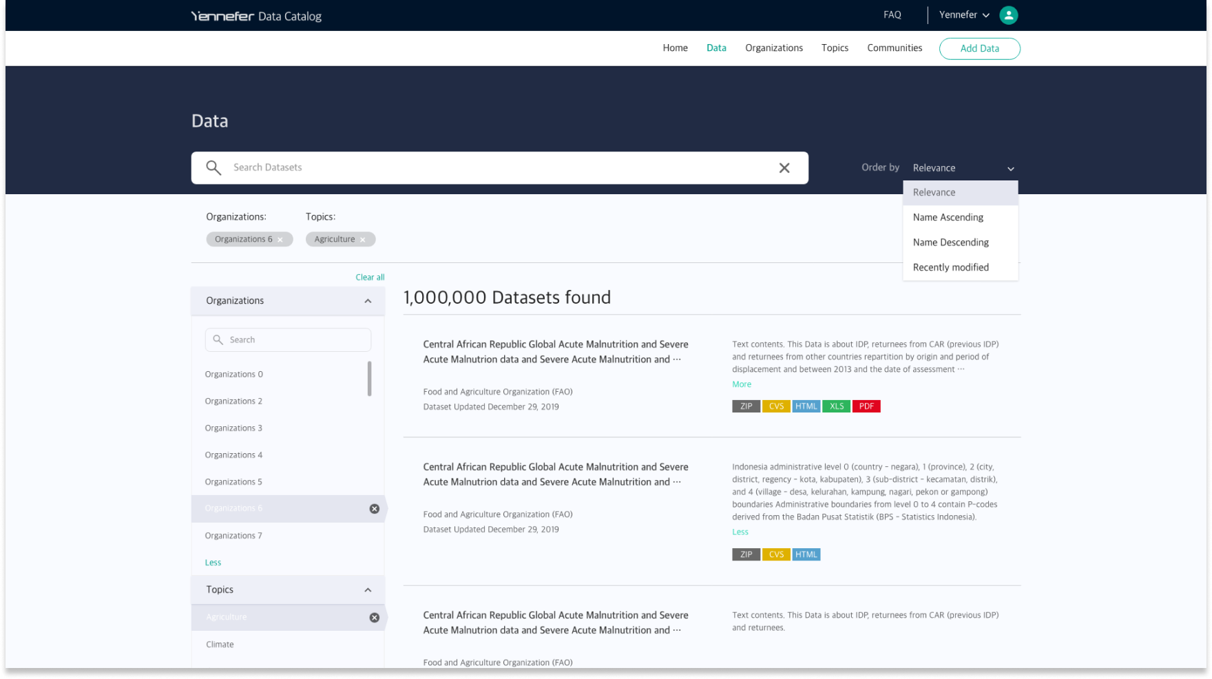
Instead of building another isolated repository, I designed the catalog around one connected workflow.
A new catalog risks being empty on day one. So the experience was seeded with indexed public sources and designed to stay useful when metadata quality was incomplete.
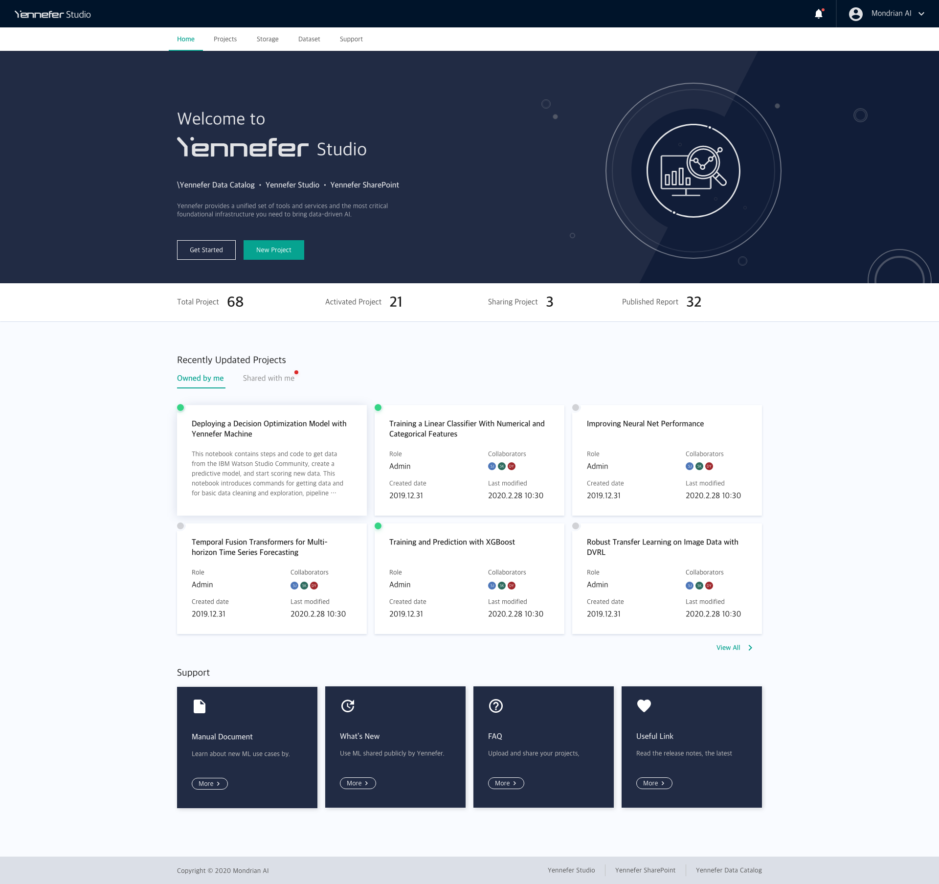
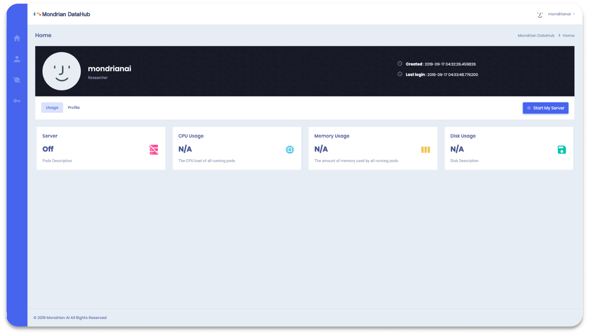
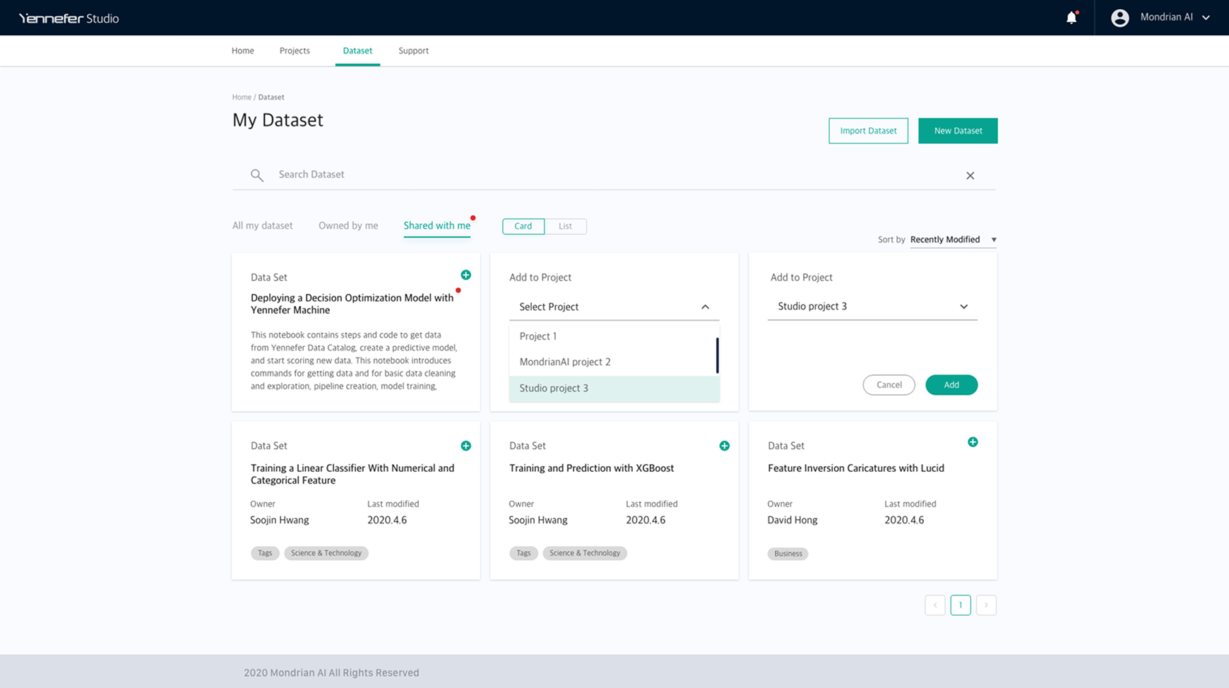
The original Studio home centered the experience on infrastructure: servers, machines, environment status. Users came back with a different mental model.
So I changed the primary object from server to project.
“I want to see overall projects’ status and latest projects, rather than data and AI model resources, on the main page.”
AI researcher · usability testing
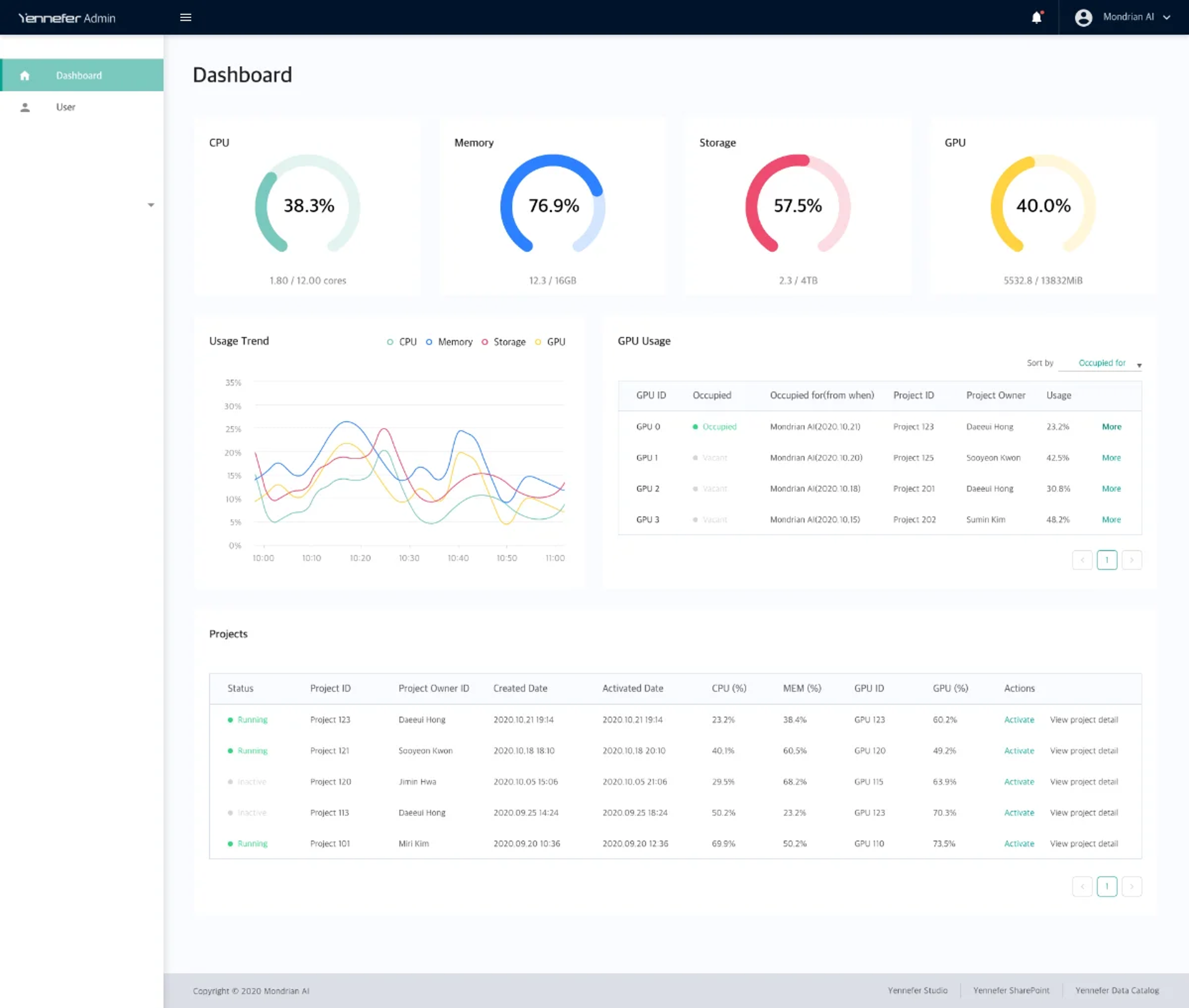
The original dashboard centered each row on a person, and the main action was stopping that person’s server. But the administrator’s real job was not monitoring people.
It was answering one question: how should scarce compute be allocated across important work?
Someone finishes a run, leaves the session open and goes home. Total utilization never catches it, because the GPU looks busy. Any one number on its own lies.
So state, time held and actual usage sit in one row, sorted by longest held, with the owner right there, so the admin has an option other than killing someone’s job.
The administrator needed three things in a single scan.
I chose C because it was the only layout that supported the allocation decision, not because it showed the most data.
Each surface answered “what exists” well. Three of them should have answered “what matters now”.
A product surface should help users understand what matters next, not just show what exists.
Designing complex enterprise products often starts before the interface. The decisions that mattered most here were:
My role was not to design three applications. It was to define an end-to-end product model around the AI research lifecycle, and translate it into a connected enterprise platform.